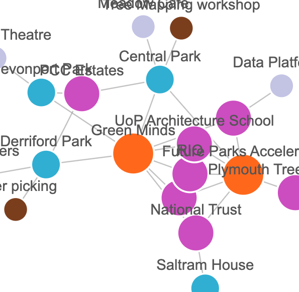
 These interactive network diagrams never fail to fascinate.
But there's more to their appeal
than simple entertainment. With this data structure we can see not just who's in a
community but how they're connected to each other, the nature of the relationships
and how they vary over time or across different categories.
Visit our community mapping example to see this in action.
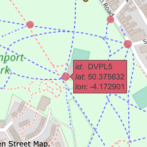 Managing our parks and open spaces means we need to understand
how they are used.
Managing our parks and open spaces means we need to understand
how they are used.
This low-cost experiment placed
motion sensors along footpaths in several parks in Plymouth;
analysing the data showed us how the patterns change over time and gave us some
insights into how and why people use the space.
Take a look at our demo
to see how busy the different paths were.
 No matter how sophisticated the toolset or how complex the problem, we
almost always need to start with the same initial collection of demographic
data; population, income, deprivation, working patterns and so on. This is
what we call our 'data mince'.
No matter how sophisticated the toolset or how complex the problem, we
almost always need to start with the same initial collection of demographic
data; population, income, deprivation, working patterns and so on. This is
what we call our 'data mince'.
Here's a quick sample
of what you can do with open data.